Friday, 10 February 2012

In what way does your media product use, develop or challenge forms and conventions of real media products?

Our task was to create a music video, a CD digipack and a magazine advert for a selected song/band that we would find on Unsigned.com. We had to look at the conventions of our genre in order to probably complete our task. The purpose of the music video is to help advertise the song, along with the magazine advert which helps not only to advertise the song, but the band too. The digipack gives the listener more information on the band, effectively helping to advertise also. A digipack is also helpful for selling a CD in the fact that it looks nicer than a normal CD and would help draw people’s eyes to it.


A music video needs to connect with the music that it is portraying. They can have a range of performance and narrative, but often contain both. The shots used are often quick cut, depending on the speed of the music and the images being shown. The genre greatly affects the style of the video as you can’t really do a completely narrative based video to a heavy metal song as the slowness usually conveyed in a narrative wouldn’t mix well with the fast and heavy music. It is the same the other way. A slower song, such as a ballad or acoustic song, wouldn’t work as well with a purely performance based video with a performance’s fast cuts and such. Genre also affects the Mise-en-scene as often the tone and lyrics of the song help you decide what you want to put into it. For example, if the lyrics said something about looking in a mirror, it’s likely that you would put a clip of someone looking in a mirror along side it.  

The genre of my chosen song was Christian rock. Because of the moral and feeling the song has, I decided that a half narrative, half performance would be best for my promo. Christian rock is a form of rock music played by individuals and bands whose members are Christians and who often focus the lyrics on matters concerned with the Christian faith. The extent to which their lyrics are Christian varies between bands. The band I have chosen has a moral, but nothing particularly Christian. It was for this reason that I tried to convey the lyrics through my promo, and the moral that the lyrics contain; choosing to do a half narrative video.

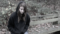
I chose to set my narrative part in the woods due to the seclusion that the trees give you. It had a feeling of loneliness that I wanted my character to be feeling, so the location was something that I wanted to enhance that feeling. The performance took place in my house, in what we call the little lounge. It is a garage conversion and so is quite light and airy; containing a large window. Having light green walls and a good amount of light, I decided that it was a good place to film the performance part of the video, it worked well, and created the sense of freeness that I had envisioned. I also asked the person I used for my narrative to wear bright clothing to make the performance more colorful to connotate happiness, while I, as the girl, wore darker clothing in the form of a black hoodie and jeans in order to show sadness and loss. This was to further show the fact that she is a broken character whom the guy is trying to tell her that she still has time and not to give up. I think the video got this thought across and shows the idea behind the lyrics quite well.

I used Roland Barthes theory of enigma codes in my video; the reason why the girl in it is so broken is not actually revealed. In this way I keep the interest of the audience till the end as they kind of want to know the full story. Though I never actually reveal the answer, but instead let people come up with their own conclusions, I believe it still allows for a sense of mystery and suspense that people are still satisfied. They have enough information to come up with several different theories and may end up thinking about it more. This is good as it inspires interest and gets people talking and thinking about the video and makes it harder to forget.

How effective is the combination of your main products and ancillary texts?

I believe that the combination of my work well together as they all consist of the same themes and ideas. All three of my package, the music video, the Digipack and the magazine advert, all contain the character drawings I had done for the video. It makes it so that they can all be recognised as the same thing and so will promote each other. I also made sure that the text was the same – the same font and colour – in order to make them more recognisable.
The magazine advert. Created on Photoshop and Microsoft Word 

The inside of the Digipack, the right panel being where the  CD would sit.

The Outside of the Digipack. The right being the front cover and the middle being the back cover.

For example, the magazine advert is eye catching and uses the same anime idea of the Digipack and video. So if someone saw the magazine advert then saw the Digipack, they would remember seeing it before and so it would catch their eyes. That works also because the pictures are almost the same on the magazine and on the front of the Digipack.
The music video is likely to be shown on Youtube rather than the traditional media of music channels as more people use the internet these days to look at certain music videos. This wouldn’t necessarily be a bad thing however, as most people tend to buy things over the internet as well, meaning that if someone saw the video on Youtube then they would very easily be able to go over to Amazon and buy the Digipack. It would perhaps lead to more sales of the Digipack through to convenience more than anything.
Other than being on the internet though, the Digipack is most likely to be seen in shops. In order to stand out from all the other CD’s around, I had to make sure that it was different. This is why I used the anime style on the front cover as it catches your eyes. It also uses quite bright colours which helps it to be eye catching and would be more likely to get people to buy it. As usual CD covers often have real people my one is different and so is more likely to be picked up from the shelf. It is not so different that it doesn’t follow the conventions, but it is different enough to be spotted.


This is a bit like the Gorillaz, though in a different style. The Gorillaz use cartoons in both their CD’s and in their video’s. In their video they get the cartoons to sing the song and so continue that theme across, the characters in the video’s becoming the band members.


My video that relates to The Gorilliaz

The Gorilliaz video.


What have you learned from your audience feedback?

In order to get an idea of what my audience looked for in a music video, I created a questionnaire and asked people to fill it out. It was important to do this as it allowed me to understand what was likely to be best suited for my audience and song. It also helped give me idea’s of what I could use in my video, as people often seemed to want the same thing. 

I gave my questionnaire to 25 people. This is the feedback I got from it that helped me to get a better understanding of the audience. This also helped me to get ideas for what I wanted to do with my video for the song that I had chosen.

How old are you?
10-20
21-30
31-40
41-50
51+
13
0
4
5
3

What gender are you?
Male
Female
12
13

Which music genre do you prefer?
Rock
Christian rock
Pop
Indi
6
4
3
0

Metal
Hip hop
Acoustics
Other
5
1
5
1

Do you watch music video’s often?
Yes
No
17
8

When you watch a music video, what do you prefer to see?
Narrative
Performance
Both
6
8
11

Would you watch a video that had a moral?
Yes
No
Maybe
16
4
5


When I was finished I posted my video on Youtube and put the link on Facebook to get people’s reactions to it. They all seemed to be very positive, but also had some constructive criticism to give me which I have reacted to and edited on my video. for example, one of the comments said that the syncing was a little out, so I went back on it and changed that; tightening everything up to that it looked better and more professional.

The comments posted on my Youtube video 
I have also posted my Digipack and Magazine advert on Facebook, in order to get people’s opinions on it.
I posted my Digipack images on Facebook.

How did you use media technologies in the construction and research, planning and evaluation stages?

In order to find a band and song that wasn’t copyrighted, I used unsigned.com. This is a website where people can put their songs for others to listen to and review. It was on there that I found A City Alive. They had two songs up, and after listening to them both I chose Still Time as it was the one that I found I had more ideas for.

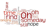
Lyric Wordle for the song I chose

After getting my song, I searched on Youtube for songs like it, and ideas I could use for my video. I found Ed Sheeran's The A Team, and Love Like Woe by The Ready Set. In The A Team, the images of the girl are in black and white and she is sad and lonely. This was the mood I wanted for her side of the story. Love Like Woe had the idea of half performance and half narrative, the performance only being the singer rather than the whole band, which is what I wanted to do. The singer in it was also backed by bright colours, which was what gave me the idea of having him try to cheer the girl up, giving her colour from the colourlessness that was her narrative.  


Ed Sheeran's The A Team

An image from my vid that was inspired by The A Team

Love Like Woe by The Ready Set

An image from my video inspired by Love Like Woe


 These two were the main inspirer’s at the beginning, but as it went on and I started planning more, The Gorillaz also inspired me through their use of cartoons characters and animation.
When we went out to film the footage I wanted for my video I made sure I got a lot of it, taking shots from many different angles. I learnt from last year that you need to get a lot of footage as often you find, when you get back, that you didn’t have enough or what you had wasn’t as good quality as you thought it was. I also made sure that I used a wider range of shots, so that I could make my video more interesting rather than having a load of shots all the same.

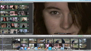
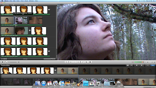
In order to create the anime styled pictures and animation, I had to learn how to use Photoshop better. It was something that I just picked up through playing around with it, but I now have a better idea of how the program works. I also needed to learn how to import pictures in Imovie so that I could get the images from Photoshop into my Video. I have also learnt how to put footage together to create quick shots that interchange with the music. I had to think about this as if the shots were to long then the video would become boring and dull to watch.
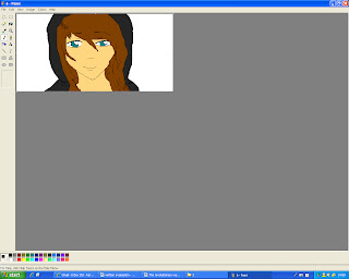
Paint. This was where I created the 'animation'. 

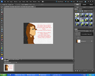
Photoshop. I was able to create my Digipack Images and the Magazine artical using this programme.

I created my actual video on IMovie. It was simple and easy to use and I was able to get all of the effects, such as black and white and tempa zone, that I wanted on it.  


In IMovie, I found the easiest way to make it so that the lip syncing was as close as possible was by using Precision Cutter. I found this out through experimentation, but this technique allowed me to change the part of the footage that I wanted without changing the time that it took. This meant that it didn’t change the rest of the video and keeps all the rest in synch.

Sometimes in my video I would come across bits of footage that weren’t exactly in time with the music, and I would have to fiddle around with that while trying not to affect the rest of the video. This meant that I had to figure out a way of changing the bit of video without making it at different times. I discovered a way of doing so using precision cutter and was able to make those bits of footage fit without too much trouble.

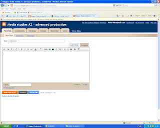
As I was creating and planning my video, I would put the idea’s I came up with on Blogger. This helped me as it allowed me to see all of my idea’s and work in one place. I also found that placing my work on Facebook and Youtube was helpful feedback wise. It allowed me to see what people thought of my video and to see what improvements I could still make. It was also easier to see what bits and pieces still needed tightening up when I was watching it with other people as I felt more conscious of what it looked like. I found this helpful as I noticed more and was able to straighten it out so that it was right.
I used Blogger to post my ideas and thoughts and used it as somewhere that I could keep them all together. It is also the medium I used in order to show all of my work.

Ed Sheeran The A Team

This video has been inspirational to me though the fact that it uses the effect of black and white. This is where I got the idea to make the narrative part of it black and white as the whole thing is narrative and shows the lyrics of the song in what is happening in the video.

The girl in the narrative sleeping on a bench. The image and footage of the video  is back and white throughout and so gives the feeling of emptiness and sadness. That there is no colour in the world and nothing worth living for. 
There is also the idea of the singer giving the person in the narrative hope, as Ed Sheeran appears in his video to buy some of what the girl is selling. I liked this idea and so decided to use it, but instead of doing it that the singer meets the person in the narrative, I made it so that the singer seemed to be singing to them and giving them their colour.

Ed Sheeran in his video
 there are many references to the lyrics in the mise-en-scene, for example the use of 'Angel Station' to back up the lyrics 'for angels to fly.' This is effective as it allows the lyrics to stick in your head as you subconsciously see them in the background as they are being sung.
Use of mise-an-scene to back up the lyrics
The shots in this video are not as ranged as some of the more performance videos, but it doesn't have to be. this is because the music is quite slow and telling the story of a slow life that doesn't really change. the cuts aren't as often either, as there isn't as much need to set a fast pace for the song as it doesn't have one.

I think that the way it has all been put together is really effective as it illustrates the lyrics and helps you to remember and understand the song more.

Wednesday, 25 January 2012

My Digipack


This is the Digipack I created for one of my ancilliary tasks. It contains the same idea of the animation style, but has some different pictures. I think it works fairly well, and goes well with my video and itself.

Outside

Inside


I also created a Magazine advert. I used the same idea of a white background and red writing as I did in the Digipack so that its easy to see that it is for the same thing.